Manipulating Love: A Deep Dive into Dark UX
Hinge

OVERVIEW
What happens when you give design the power to manipulate emotion? I redesigned Hinge to find out.
In the realm of digital design, the line between persuasion and manipulation is often blurred. This project embarked on a provocative journey: intentionally implementing dark UX patterns within Hinge to understand their impact on user behaviour and the ethical boundaries they challenge.
Role
Tools
Team
Timeline
Figma
UX/UI Designer
Researcher
Solo Project
4 Weeks
tldr
Confirm shaming
I added emotionally charged prompts to the account deletion flow to in-still guilt and discourage users from leaving the app.


Comparison Prevention
I redesigned the subscription page to obscure direct comparisons between plans, subtly pushing users toward the premium tier.
View Prototype →
The Challenge
When Design Crosses a Line
Hinge calls itself “The dating app designed to be deleted.” But after spending time using the app, I noticed something unsettling.
Even though its branding emphasizes connection, many of its design choices seem optimized to keep users in a cycle—endlessly swiping, endlessly subscribing.
This contradiction got me thinking:
What if I leaned into the manipulation?
What if I redesigned Hinge to intentionally use dark UX patterns—just to see how far it could go?
This Prompted the Question
How might we explore and implement dark UX patterns, in a way that subtly influences user decisions in the Hinge app?
Analyzing Hinge Features
Understanding its Functionality
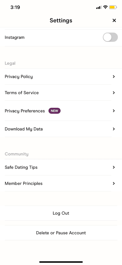
In its current state, the Hinge app employs a basic user flow for account deletion and subscription plan selection. However, there are opportunities to introduce friction in these flows to subtly steer user decisions.
I analyzed current features of the Hinge app to understand its functionality, including the matching process, messaging capabilities, and user prompts that facilitate meaningful connections.
Matching w/ Profiles
Users see potential matches based on preferences and compatibility.
Matches are made by liking or commenting on specific profile aspects.
Algorithms suggest compatible matches to increase meaningful interactions.

Messaging & Chatting
Direct communication with matches within the app.
Features include text messaging, photo sharing, and voice messaging.
Safety and privacy measures to prevent unwanted messages.
Prompts & Questions
Prompts serve as icebreakers and conversation starters.
Users share personal anecdotes, preferences, and experiences.
Options to respond to Hinge-provided prompts or create custom ones.
Designing for Deceit
To understand how small design choices shape big emotions, I used two well-known dark UX patterns:
Confirmshaming
Making users feel guilty for making a choice—especially when they try to leave.
Obstruction
Intentionally making something harder to understand or complete, such as hiding comparisons or de-emphasizing less profitable options.
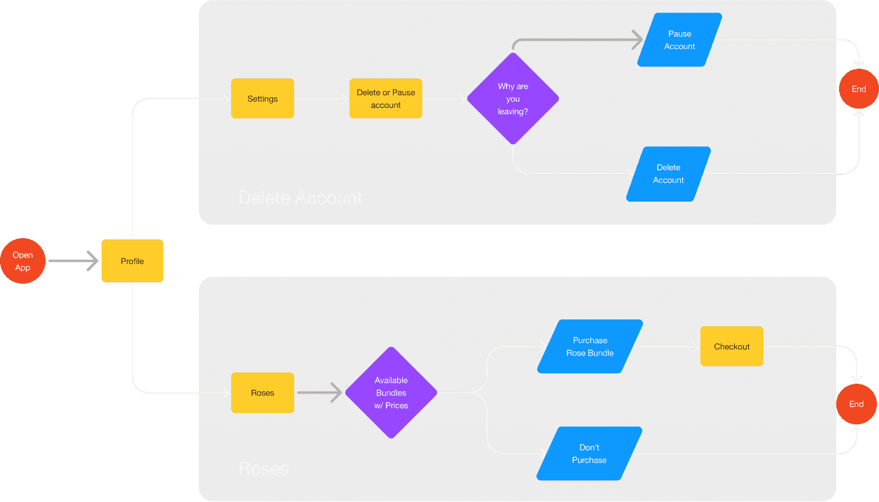
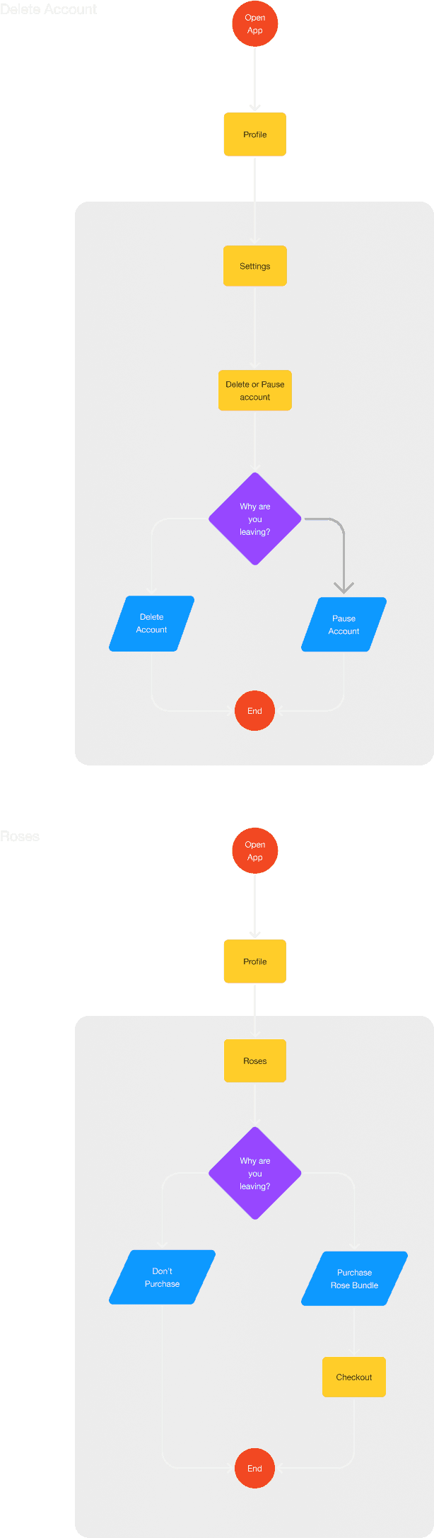
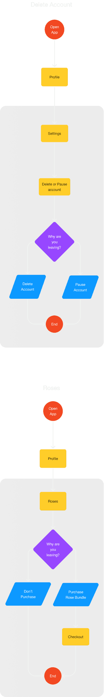
User Flow
Current Flow
User flow was created to identify opportunities that allows seamless integrations of new interactions without disrupting the current flow.
Trend Analysis
Analyzed current trends in the Hinge app, focusing on how it employs premium features like Roses and Boosts, as well as psychological triggers and gamification to drive user engagement and in-app purchases.

I spy a trend
Premium Features & Microtransactions:
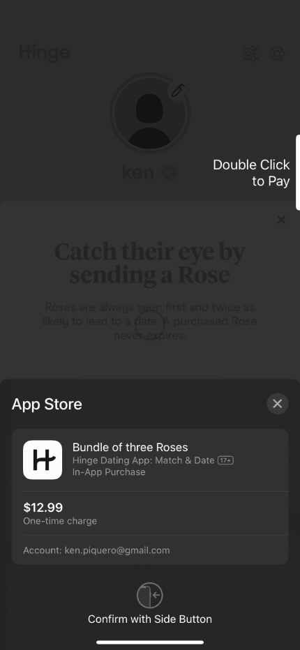
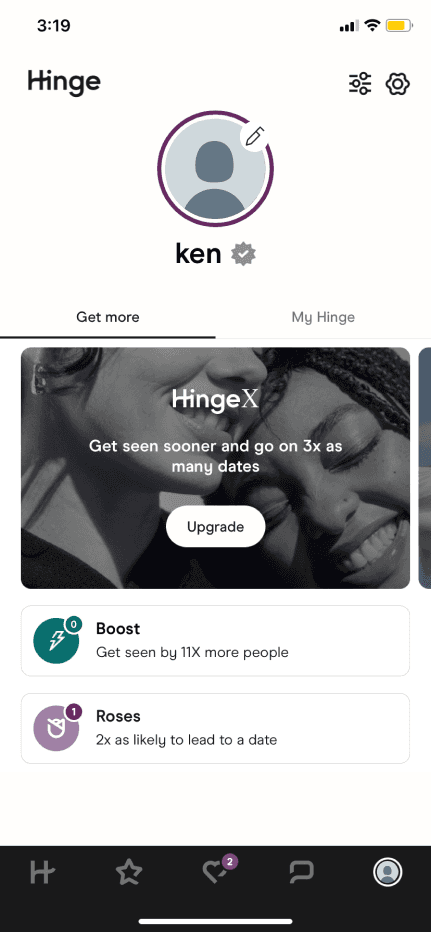
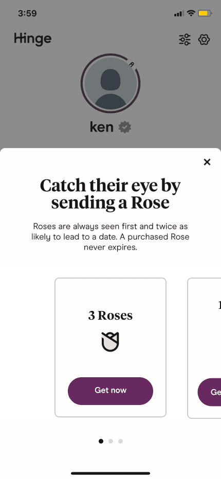
Hinge offers premium features such as Roses and Boosts for users willing to pay. Roses allow users to send a special message to someone they're interested in, while Boosts increase visibility within the app. These microtransactions provide users with added functionality and opportunities to enhance their experience on the platform.
I spy a trend
Leveraging Psychological Triggers:
Hinge's monetization strategies leverage psychological triggers commonly found in gaming and social media platforms. For example, Boosts create a sense of urgency and competitiveness by allowing users to temporarily increase their visibility and chances of matching with others. Similarly, Roses evoke feelings of exclusivity and personalization, encouraging users to invest in these virtual gifts to express interest.
Misleading Users
Gamification of User Interaction:
Hinge "game-ifies" the dating experience through various features and mechanics designed to increase engagement and retention. For instance, users are rewarded with prompts to comment on or like specific aspects of a potential match's profile, fostering interaction and conversation starters. This gamified approach makes the app more dynamic and entertaining for users, enhancing their overall experience.
Misleading Users
Encouraging In-App Purchases:
By integrating monetization features seamlessly into the user experience, Hinge encourages in-app purchases without compromising usability or detracting from the primary goal of facilitating meaningful connections. Users are enticed to buy Roses or Boosts to stand out or make a stronger impression, aligning with their desire to succeed in the dating game.
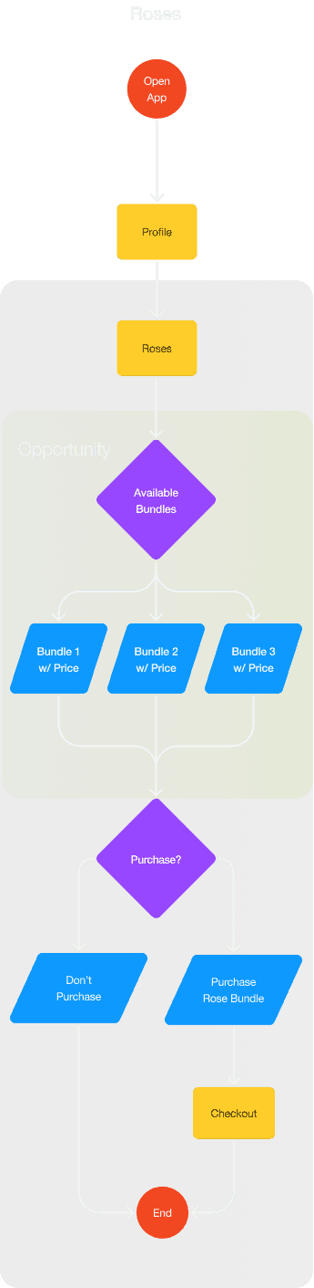
Opportunity
Key Opportunities
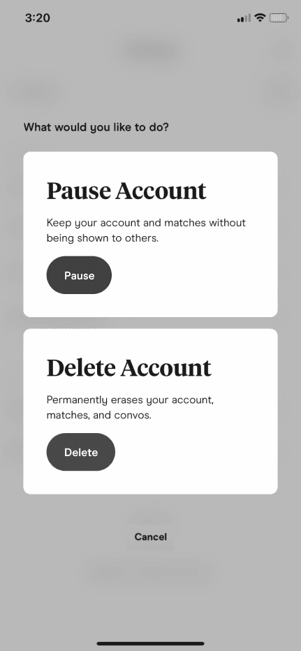
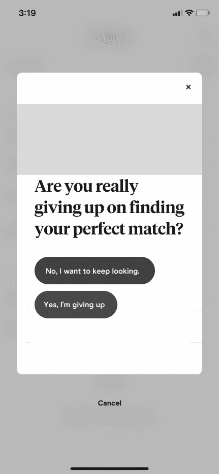
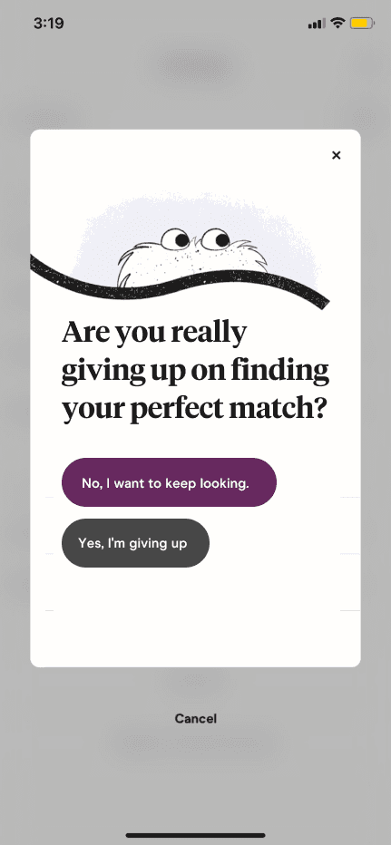
⚠️ Confirmshaming ⚠️
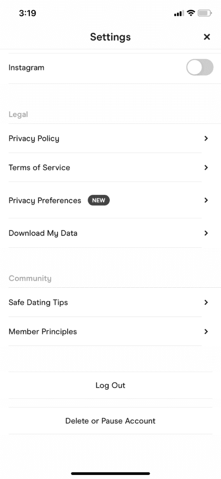
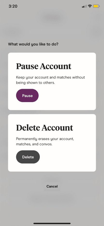
Original Flow: Users are asked a straightforward question when deactivating their account.
Deceptive Redesign: Instead of a simple confirmation, users are guilt-tripped with phrases like “Are you really giving up?” to account deactivation
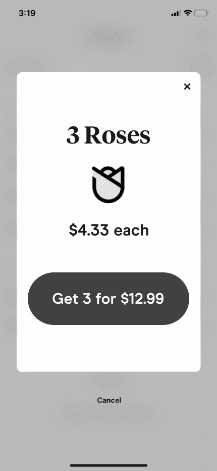
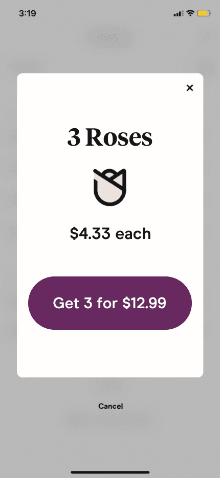
⚠️ Comparison prevention ⚠️
Original Flow: Users can easily compare subscription plans based on features and pricing.
Deceptive Redesign: Subscription plans are intentionally presented in a confusing layout, making it hard for users to compare directly.
User Testing & Feedback
Mid-fidelity: What Users Said
On Icons: "The heart icon is clear, but the rose icon feels less intuitive—I wasn’t sure what it represented right away."
On Emotional Prompts: "The wording about 'missing out on connections' feels a little pushy but does make me pause and think."
On Navigation: "The flow is smooth, but the placement of the premium features isn't obvious. I almost missed it."
High-fidelity: What Users Said
On Emotional Prompts: "The message about ‘not giving up’ feels more natural now—it made me hesitate before trying to deactivate."
On Comparison-Prevention Tactics: "Seeing the premium plan benefits laid out without side-by-side comparisons made me consider upgrading because it didn’t feel overwhelming."
On Overall Design: "The polished visuals make the experience feel cohesive. I didn’t feel like I was being pressured even though I noticed the subtle nudges."
Results:
“Hiding the price of roses made me curious to explore the feature further. It felt exclusive and made me wonder about the benefits, which kept me engaged with the app.”
“The message about 'giving up' when I tried to deactivate my account made me pause and rethink. It felt guilt-inducing but effective in encouraging me to stay.”
“The subtle language made me question my decision to leave—it felt like I might miss out on something meaningful, so I decided to give it another shot.”
7/10 users abandoned deletion halfway through due to confirmshaming.
8/10 users chose the most expensive plan, even when it didn’t suit their needs.
Only 2 users noticed that plan information was missing or unclear.
END
Final Product
Confirmshaming
For the confirmshaming pattern, I introduced emotional prompts in the account deletion process to create hesitation.
Comparison Prevention
For comparison prevention, I redesigned the subscription layout, making it harder to compare tiers directly while visually emphasizing premium options.
View Prototype →

This Was Never About Hinge
This wasn’t an attack on Hinge.
It was a question:
What happens when we use design to take away user control—and they don’t even notice?
Designers don’t just build screens.
We build emotions, decisions, and behavior.
I walked away from this project feeling uneasy.
Yes, it worked. Yes, it was clever. But no, it wasn’t right.
Reflection
We Can Do Better
Dark UX works because it exploits how people feel, hesitate, or trust.
It’s subtle.
It’s effective.
It’s dangerous.
If we don’t stay vigilant, we risk becoming the very thing we’re taught to resist—manipulators with nice typefaces.
Balance between persuasion and ethics
This project revealed the fine line between persuasive design and manipulative tactics. Taking too much control from the user harms the overall experience and diminishes trust.
Noticing dark patterns in everyday design
By studying deceptive UX patterns, I’ve become more aware of their prevalence across various platforms. This newfound awareness has reinforced my commitment to user-centered design, focusing on transparency and empowerment.
Manipulating Love: A Deep Dive into Dark UX
Hinge

OVERVIEW
What happens when you give design the power to manipulate emotion? I redesigned Hinge to find out.
In the realm of digital design, the line between persuasion and manipulation is often blurred. This project embarked on a provocative journey: intentionally implementing dark UX patterns within Hinge to understand their impact on user behaviour and the ethical boundaries they challenge.
Role
Tools
Team
Timeline
Figma
UX/UI Designer
Researcher
Solo Project
4 Weeks
tldr
Confirm shaming
I added emotionally charged prompts to the account deletion flow to in-still guilt and discourage users from leaving the app.
Comparison Prevention
I redesigned the subscription page to obscure direct comparisons between plans, subtly pushing users toward the premium tier.
View Prototype →
The Challenge
When Design Crosses a Line
Hinge calls itself “The dating app designed to be deleted.” But after spending time using the app, I noticed something unsettling.
Even though its branding emphasizes connection, many of its design choices seem optimized to keep users in a cycle—endlessly swiping, endlessly subscribing.
This contradiction got me thinking:
What if I leaned into the manipulation?
What if I redesigned Hinge to intentionally use dark UX patterns—just to see how far it could go?
This Prompted the Question
How might we explore and implement dark UX patterns, in a way that subtly influences user decisions in the Hinge app?
Analyzing Hinge Features
Understanding its Functionality
In its current state, the Hinge app employs a basic user flow for account deletion and subscription plan selection. However, there are opportunities to introduce friction in these flows to subtly steer user decisions.
I analyzed current features of the Hinge app to understand its functionality, including the matching process, messaging capabilities, and user prompts that facilitate meaningful connections.
Matching w/ Profiles
Users see potential matches based on preferences and compatibility.
Matches are made by liking or commenting on specific profile aspects.
Algorithms suggest compatible matches to increase meaningful interactions.
Messaging & Chatting
Direct communication with matches within the app.
Features include text messaging, photo sharing, and voice messaging.
Safety and privacy measures to prevent unwanted messages.
Prompts & Questions
Prompts serve as icebreakers and conversation starters.
Users share personal anecdotes, preferences, and experiences.
Options to respond to Hinge-provided prompts or create custom ones.
Designing for Deceit
To understand how small design choices shape big emotions, I used two well-known dark UX patterns:
Confirmshaming
Making users feel guilty for making a choice—especially when they try to leave.
Obstruction
Intentionally making something harder to understand or complete, such as hiding comparisons or de-emphasizing less profitable options.
User Flow
Current Flow
User flow was created to identify opportunities that allows seamless integrations of new interactions without disrupting the current flow.
Trend Analysis
Analyzed current trends in the Hinge app, focusing on how it employs premium features like Roses and Boosts, as well as psychological triggers and gamification to drive user engagement and in-app purchases.

I spy a trend
Premium Features & Microtransactions:
Hinge offers premium features such as Roses and Boosts for users willing to pay. Roses allow users to send a special message to someone they're interested in, while Boosts increase visibility within the app. These microtransactions provide users with added functionality and opportunities to enhance their experience on the platform.

I spy a trend
Leveraging Psychological Triggers:
Hinge's monetization strategies leverage psychological triggers commonly found in gaming and social media platforms. For example, Boosts create a sense of urgency and competitiveness by allowing users to temporarily increase their visibility and chances of matching with others. Similarly, Roses evoke feelings of exclusivity and personalization, encouraging users to invest in these virtual gifts to express interest.

Misleading Users
Gamification of User Interaction:
Hinge "game-ifies" the dating experience through various features and mechanics designed to increase engagement and retention. For instance, users are rewarded with prompts to comment on or like specific aspects of a potential match's profile, fostering interaction and conversation starters. This gamified approach makes the app more dynamic and entertaining for users, enhancing their overall experience.

Misleading Users
Encouraging In-App Purchases:
By integrating monetization features seamlessly into the user experience, Hinge encourages in-app purchases without compromising usability or detracting from the primary goal of facilitating meaningful connections. Users are enticed to buy Roses or Boosts to stand out or make a stronger impression, aligning with their desire to succeed in the dating game.
Opportunity
Key Opportunities
⚠️ Confirmshaming ⚠️
Original Flow: Users are asked a straightforward question when deactivating their account.
Deceptive Redesign: Instead of a simple confirmation, users are guilt-tripped with phrases like “Are you really giving up?” to account deactivation
⚠️ Comparison prevention ⚠️
Original Flow: Users can easily compare subscription plans based on features and pricing.
Deceptive Redesign: Subscription plans are intentionally presented in a confusing layout, making it hard for users to compare directly.
User Testing & Feedback
Mid-fidelity: What Users Said
On Icons: "The heart icon is clear, but the rose icon feels less intuitive—I wasn’t sure what it represented right away."
On Emotional Prompts: "The wording about 'missing out on connections' feels a little pushy but does make me pause and think."
On Navigation: "The flow is smooth, but the placement of the premium features isn't obvious. I almost missed it."
High-fidelity: What Users Said
On Emotional Prompts: "The message about ‘not giving up’ feels more natural now—it made me hesitate before trying to deactivate."
On Comparison-Prevention Tactics: "Seeing the premium plan benefits laid out without side-by-side comparisons made me consider upgrading because it didn’t feel overwhelming."
On Overall Design: "The polished visuals make the experience feel cohesive. I didn’t feel like I was being pressured even though I noticed the subtle nudges."
Results:
“Hiding the price of roses made me curious to explore the feature further. It felt exclusive and made me wonder about the benefits, which kept me engaged with the app.”
“The message about 'giving up' when I tried to deactivate my account made me pause and rethink. It felt guilt-inducing but effective in encouraging me to stay.”
7/10 users abandoned deletion halfway through due to confirmshaming.
8/10 users chose the most expensive plan, even when it didn’t suit their needs.
Only 2 users noticed that plan information was missing or unclear.
END
Final Product
Confirmshaming
For the confirmshaming pattern, I introduced emotional prompts in the account deletion process to create hesitation.
Comparison Prevention
For comparison prevention, I redesigned the subscription layout, making it harder to compare tiers directly while visually emphasizing premium options.
View Prototype →
This Was Never About Hinge
This wasn’t an attack on Hinge.
It was a question:
What happens when we use design to take away user control—and they don’t even notice?
Designers don’t just build screens.
We build emotions, decisions, and behavior.
I walked away from this project feeling uneasy.
Yes, it worked. Yes, it was clever. But no, it wasn’t right.
Reflection
We Can Do Better
Dark UX works because it exploits how people feel, hesitate, or trust.
It’s subtle.
It’s effective.
It’s dangerous.
If we don’t stay vigilant, we risk becoming the very thing we’re taught to resist—manipulators with nice typefaces.
Balance between persuasion and ethics
This project revealed the fine line between persuasive design and manipulative tactics. Taking too much control from the user harms the overall experience and diminishes trust.
Noticing dark patterns in everyday design
By studying deceptive UX patterns, I’ve become more aware of their prevalence across various platforms. This newfound awareness has reinforced my commitment to user-centered design, focusing on transparency and empowerment.
Manipulating Love: A Deep Dive into Dark UX
Hinge

Role
UX/UI Designer
Researcher
Tools
Figma
Team
Solo
Timeline
4 weeks
OVERVIEW
What happens when you give design the power to manipulate emotion? I redesigned Hinge to find out.
In the realm of digital design, the line between persuasion and manipulation is often blurred. This project embarked on a provocative journey: intentionally implementing dark UX patterns within Hinge to understand their impact on user behaviour and the ethical boundaries they challenge.
Comparison Prevention
I redesigned the subscription page to obscure direct comparisons between plans, subtly pushing users toward the premium tier.
View Prototype →
tldr
Confirm shaming
I added emotionally charged prompts to the account deletion flow to in-still guilt and discourage users from leaving the app.
The Challenge
When Design Crosses a Line
Hinge calls itself “The dating app designed to be deleted.” But after spending time using the app, I noticed something unsettling.
Even though its branding emphasizes connection, many of its design choices seem optimized to keep users in a cycle—endlessly swiping, endlessly subscribing.
This contradiction got me thinking:
What if I leaned into the manipulation?
What if I redesigned Hinge to intentionally use dark UX patterns—just to see how far it could go?
This Prompted the Question
How might we create a more transparent and user-friendly privacy experience for PRESTO users so they can easily understand and control their personal data?
Understanding its Functionality
Understanding its Functionality
In its current state, the Hinge app employs a basic user flow for account deletion and subscription plan selection. However, there are opportunities to introduce friction in these flows to subtly steer user decisions.
I analyzed current features of the Hinge app to understand its functionality, including the matching process, messaging capabilities, and user prompts that facilitate meaningful connections.
Matching w/ Profiles
Users see potential matches based on preferences and compatibility.
Matches are made by liking or commenting on specific profile aspects.
Algorithms suggest compatible matches to increase meaningful interactions.
Messaging & Chatting
Direct communication with matches within the app.
Features include text messaging, photo sharing, and voice messaging.
Safety and privacy measures to prevent unwanted messages.
Prompts & Questions
Prompts serve as icebreakers and conversation starters.
Users share personal anecdotes, preferences, and experiences.
Options to respond to Hinge-provided prompts or create custom ones.
Designing for Deceit
To understand how small design choices shape big emotions, I used two well-known dark UX patterns:
Confirmshaming
Making users feel guilty for making a choice—especially when they try to leave.
Obstruction
Intentionally making something harder to understand or complete, such as hiding comparisons or de-emphasizing less profitable options.
User Flow
Current Flow
User flow was created to identify opportunities that allows seamless integrations of new interactions without disrupting the current flow.
Trend Analysis
Analyzed current trends in the Hinge app, focusing on how it employs premium features like Roses and Boosts, as well as psychological triggers and gamification to drive user engagement and in-app purchases.

I spy a trend
Premium Features & Microtransactions:
Hinge offers premium features such as Roses and Boosts for users willing to pay. Roses allow users to send a special message to someone they're interested in, while Boosts increase visibility within the app. These microtransactions provide users with added functionality and opportunities to enhance their experience on the platform.

I spy a trend
Leveraging Psychological Triggers:
Hinge's monetization strategies leverage psychological triggers commonly found in gaming and social media platforms. For example, Boosts create a sense of urgency and competitiveness by allowing users to temporarily increase their visibility and chances of matching with others. Similarly, Roses evoke feelings of exclusivity and personalization, encouraging users to invest in these virtual gifts to express interest.

Misleading Users
Gamification of User Interaction:
Hinge "game-ifies" the dating experience through various features and mechanics designed to increase engagement and retention. For instance, users are rewarded with prompts to comment on or like specific aspects of a potential match's profile, fostering interaction and conversation starters. This gamified approach makes the app more dynamic and entertaining for users, enhancing their overall experience.

Misleading Users
Encouraging In-App Purchases:
By integrating monetization features seamlessly into the user experience, Hinge encourages in-app purchases without compromising usability or detracting from the primary goal of facilitating meaningful connections. Users are enticed to buy Roses or Boosts to stand out or make a stronger impression, aligning with their desire to succeed in the dating game.
Opportunity
Key Opportunities
User flow was created to identify opportunities that allows seamless integrations of new interactions without disrupting the current flow.
Original Flow: Users are asked a straightforward question when deactivating their account.
Deceptive Redesign: Instead of a simple confirmation, users are guilt-tripped with phrases like “Are you really giving up?” to account deactivation
⚠️ Confirmshaming ⚠️
Original Flow: Users can easily compare subscription plans based on features and pricing.
Deceptive Redesign: Subscription plans are intentionally presented in a confusing layout, making it hard for users to compare directly.
⚠️ Comparison prevention ⚠️

User Testing & Feedback
Mid-fidelity: What Users Said
On Icons: "The heart icon is clear, but the rose icon feels less intuitive—I wasn’t sure what it represented right away."
On Emotional Prompts: "The wording about 'missing out on connections' feels a little pushy but does make me pause and think."
On Navigation: "The flow is smooth, but the placement of the premium features isn't obvious. I almost missed it."
Results:
“Hiding the price of roses made me curious to explore the feature further. It felt exclusive and made me wonder about the benefits, which kept me engaged with the app.”
“The message about 'giving up' when I tried to deactivate my account made me pause and rethink. It felt guilt-inducing but effective in encouraging me to stay.”
7/10 users abandoned deletion halfway through due to confirmshaming.
8/10 users chose the most expensive plan, even when it didn’t suit their needs.
Only 2 users noticed that plan information was missing or unclear.
END
Final Product
Confirmshaming
For the confirmshaming pattern, I introduced emotional prompts in the account deletion process to create hesitation.
Comparison Prevention
For comparison prevention, I redesigned the subscription layout, making it harder to compare tiers directly while visually emphasizing premium options.
View Prototype →
This Was Never About Hinge
This wasn’t an attack on Hinge.
It was a question:
What happens when we use design to take away user control—and they don’t even notice?
Designers don’t just build screens.
We build emotions, decisions, and behavior.
I walked away from this project feeling uneasy.
Yes, it worked. Yes, it was clever. But no, it wasn’t right.
Reflection
We Can Do Better
Dark UX works because it exploits how people feel, hesitate, or trust.
It’s subtle.
It’s effective.
It’s dangerous.
If we don’t stay vigilant, we risk becoming the very thing we’re taught to resist—manipulators with nice typefaces.
Balance between persuasion and ethics
This project revealed the fine line between persuasive design and manipulative tactics. Taking too much control from the user harms the overall experience and diminishes trust.
Noticing dark patterns in everyday design
By studying deceptive UX patterns, I’ve become more aware of their prevalence across various platforms. This newfound awareness has reinforced my commitment to user-centered design, focusing on transparency and empowerment.